
Turning fragmented fraud data into an investigation workspace.
A clearer way for fraud analysts to find the evidence, connect the signals, and act.
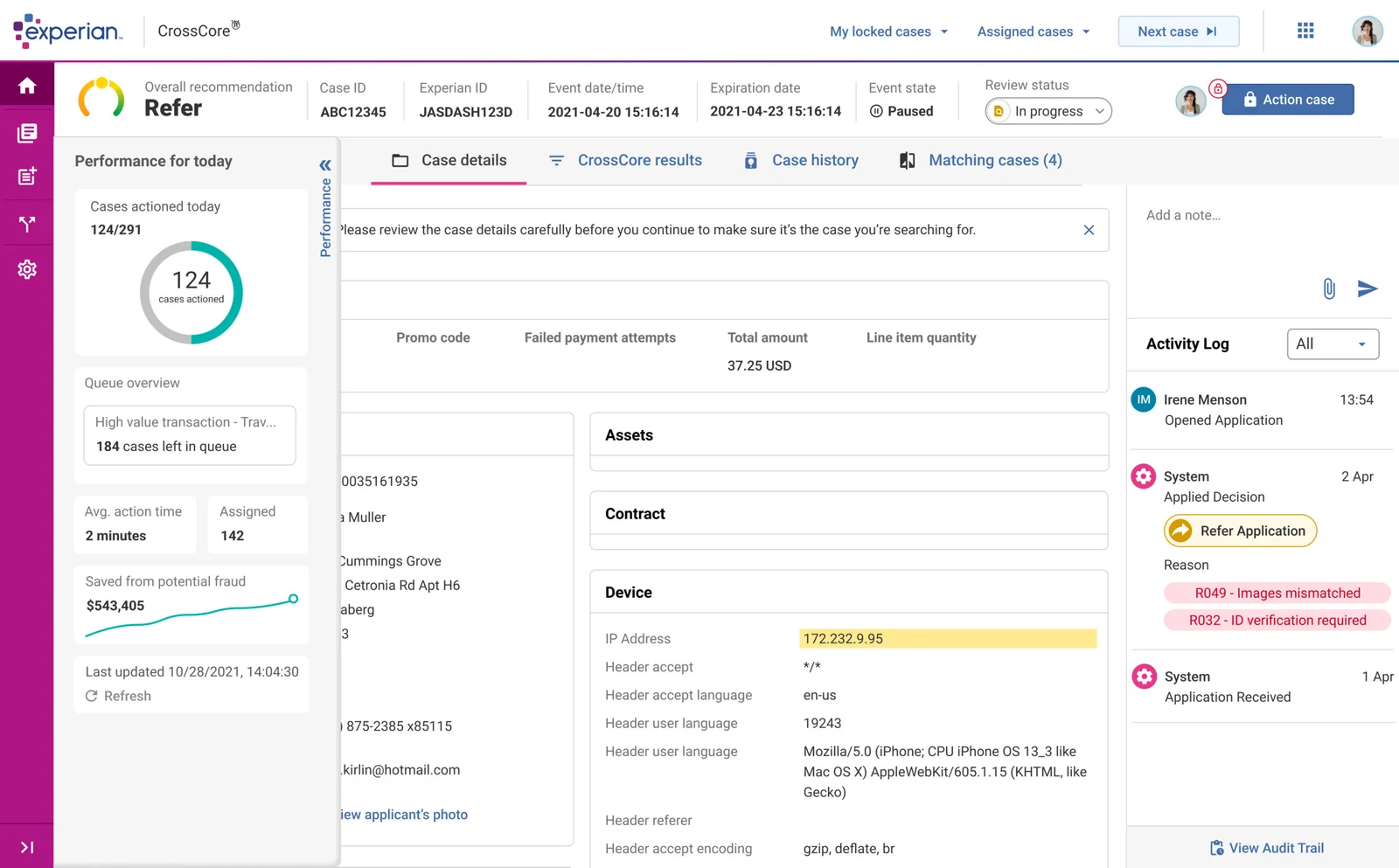
Less time finding the evidence. More time making the decision.
- saved per task
- 3+ min
- detection rate
- +23%
- product modules
- 12
The problem worth solving
Fraud analysts had to piece together cases across fragmented navigation and dense data. Every detour slowed a decision. For customer success, the same complexity meant more handholding before a new analyst could work independently.
My mandate
I led the sidebar and drawer navigation redesign, refined the identification interface, and improved data visualization. I worked with product, engineering, sales, customer success, and active fraud analysts. My contribution was the interaction model and reusable design patterns; product delivery was cross-functional.
Give complexity a clear structure.
- 01
Case queue
The analyst’s starting point
- 02
Contextual workspace
Navigation + identification
- 03
Connected evidence
Signals + relationships
- 04
Case action
Decision + activity history
A conceptual map of the product relationships, redrawn for this case study.
Three decisions that changed the product.
Make the sidebar part of the workspace.
Analysts organize work around cases. Navigation needed to reflect that mental model and keep critical tools in context.
- ALTERNATIVE
- Keep the sidebar as a list of secondary destinations.
- TRADEOFF
- A more opinionated structure required agreement on how cases should be grouped.
- RESULT
- Clearer categories and contextual drawers contributed to 3+ minutes saved per task.
Resolve the flow before polishing the screen.
Engineering wanted detailed comps early. I used low-fidelity prototypes for the first two test rounds to focus feedback on navigation.
- ALTERNATIVE
- Move directly into high-fidelity screens to accelerate the handoff.
- TRADEOFF
- Delay visual polish to resolve expensive structural problems earlier.
- RESULT
- The existing project record reports 14 navigation issues caught before high-fidelity design.
Design the pattern once, then make it travel.
The same density and navigation problems appeared beyond the fraud workspace. Components needed to work across the suite.
- ALTERNATIVE
- Optimize each screen independently for the immediate release.
- TRADEOFF
- A slower up-front investment in shared structure and consistency.
- RESULT
- The resulting design language supported 12 product modules.
The evidence, in context.
Grouped navigation, a clearer identification view, and relationship visualization each support a different moment in an investigation.
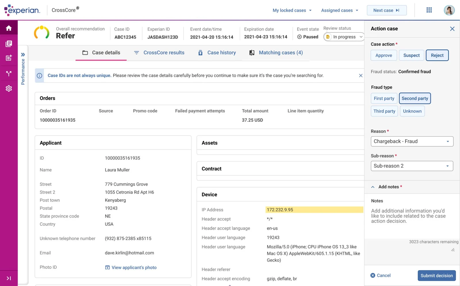
Experian sidebar grouping and contextual navigation
Exploration record: low-fidelity navigation was tested before detailed UI. The discarded wireframes are not available in the repository, so the gallery shows retained product captures.
How we knew.
User story mapping brought together sales, customer success, and fraud analysts. Moderated sessions tested navigation with active analysts before production. The existing portfolio reports 3+ minutes saved per task, 40% faster onboarding, and a 23% detection-rate increase. These are project-level outcomes; the source does not isolate the contribution of each UI change.
The leverage I left behind
A shared navigation and component language across 12 modules. The work gave teams a repeatable way to manage dense information, keep tools in context, and support self-service onboarding.
What I’d do differently now
Reflection draft: pair the task-time result with task definitions, cohort size, and measurement windows. That would make it easier to separate navigation improvements from other changes in detection performance.